Apparently, the new blogger interface has caused my blog to freak out. Hopefully, I'll get it back to looking normal soon.
Update: Yesterday, my blog looked like some kind of odd, abstract painting, with blocks of texts and images lying on top of each other, and most of the text unreadable. I have to admit that it kind of freaked me out to see my blog in pieces, like the Scarecrow in the Wizard of Oz ripped to shreds by flying monkeys. I sent panicky text messages to Scrivener, who logged on and used his mad computer skills to rescue the header that Dr. MMMmmmm designed for me six years ago.
Now that I'm used to it, the new blogger interface is fairly easy to use, so I've been playing around with the new blogger templates. If the colours and shapes keep changing, it's not your imagination. Feel free to chime in with your opinion on what the blog should look like.
18 comments:
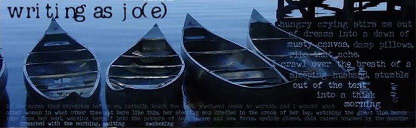
oh dear, it does look different, but the masthead looks the same. You know, I like it clean like that... maybe I should change mine too.
Now, I love your masthead, so I hope you don't change it, but if you do, I know I'll get used to it. ;)
What new blogger is this? Or just a new template that you used (therefore losing the old customizations)?
I think the only thing that looks strange to me in your blog is the font... I like the light blue background.
Lilian: Thanks for the feedback. I'm still playing around with it. Scrivener rescued the old masthead for me.
It's the same blogger that I've been using all along -- they just updated everything, and for some reason, it made my blog go all weird. So I had to go with a new template.
And yeah, I'm not sure about the font either. I think it's the same one I used before, but for some reason it looks different now.
it looks fine to me, just a little different.
I actually like the new, clean design. But I'm glad you kept the header.
JT
Grey background or light blue? I keep switching back and forth ....
Right now the gray background is really lovely with the blue in the header photo. But, in winter, I suspect the blue might be more pleasant because so much of the world is gray? Just a thought.
Oh, good point, museyme.
I think the light blue actually looks nicer, but I'm thinking that the grey is more neutral as a background for the various photos I put up.
Or maybe I should just keep changing it to match the sky here. Which means grey, most of the time.
It looks grayish blue to me, and I like that. :)
Oh, there are some days when it's not so gray. :)
I like the look. And, I am glad you still have that lovely picture. Very calming. :)
I think the blue-gray looks good. The font is fine--clean and readable. I like the random Flickr photo thingy in the sidebar.
I think bluish gray is a good background for photos. That's what they use behind kids' school pictures.
I'm glad you kept the old header.
I have mixed feelings about the thingy on the sidebar that shows random photos from my Flickr account. Is it distracting?
A bonus to the new format is that I have a blogroll again.
I like the rotator in the sidebar--you have so many great photos!
I like it!
I'm rather grateful you're using this new format. The previous one had no way to easily go from post to post, unless you went to the very newest first and used the "recent" posts list to go backward.
Having the "newer post"/"older post" links at the bottom of each post is very nice!
The constantly changing photographs on the side is distracting. I'd get rid of that.
T.
Post a Comment